Spruill Rebrand
The Spruill Center for the Arts is a nonprofit arts organization in the heart of Dunwoody, GA. What began as a center for art classes has grown to include a gallery, special events spaces and artists studios. Ahead of its 50th anniversary celebration, Spruill’s leadership team wanted to align their branding with the center’s long history, its current breadth of offerings, and its aspirations for the future. We set out to modernize the brand while keeping its welcoming, community-focused spirit alive. The refreshed logo had to reflect the four key branches of the organization, working across all brand touch-points — from course catalogs to gallery signage.
Client
Spruill Center for the Arts
Role
Design Lead
CONTRIBUTION
Logo Redesign
01 ––
Discovery
research
In early conversations, the Spruill team shared that the name is frequently misspelled or misread. It was important that the new logo not only look artistic but also be clear and instantly legible. While we explored expressive shapes and playful interpretations, the client emphasized a preference for clarity and balance in the wordmark.


02 ––
Vision
strategy
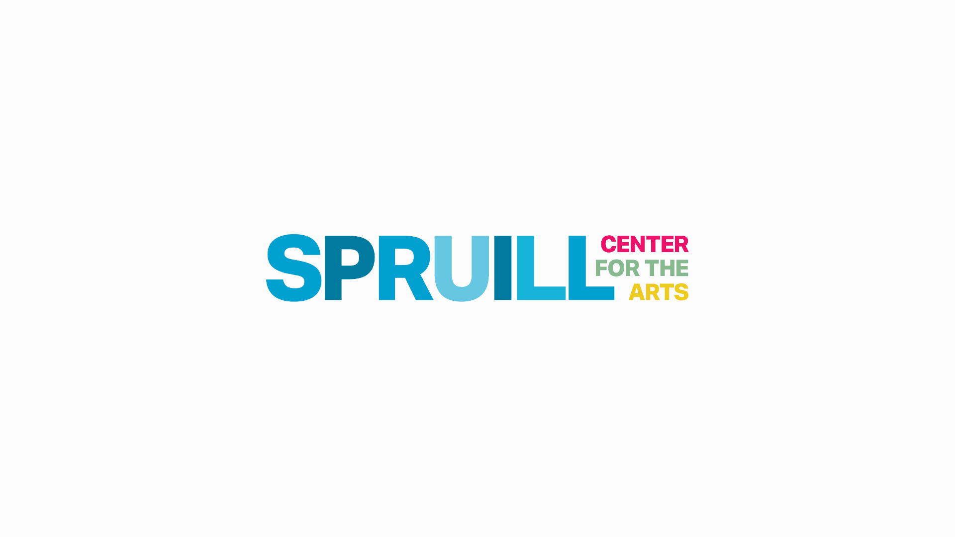
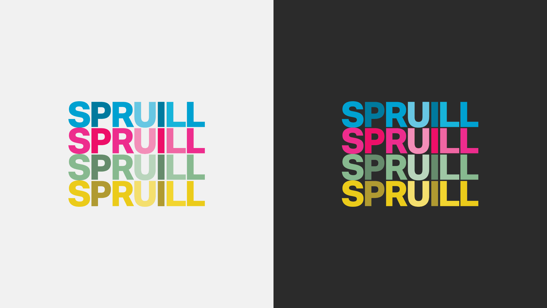
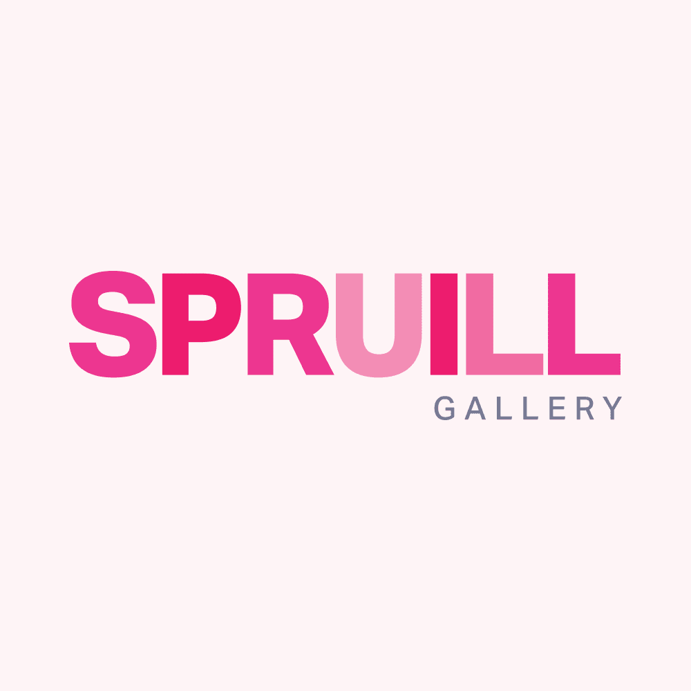
We built a bold, modern wordmark centered around legibility and motion — layering subtle hues to create a sense of depth and energy without compromising readability. Inspired by CMYK print processes, we created a tailored color system for Spruill’s four core branches:
Cyan → Education
Magenta → Gallery
Yellow → Studios
Moss Green → Events
Each color plays a role in a modular brand system while also contributing to the layered main logo.
Execution
Clean sans-serif typography with layered tones for movement
High contrast and wide letter spacing to reinforce correct spelling
Sub-brand lockups for each sector using its designated color